New cover for children's book
This new cover came about after an increasingly nagging feeling that it can be improved. The orange background did not grow on me. So I sat myself down one day to work and re-work it, agonizing over the pedagogical aspects of the type and how kids would perceive the book. Would they find the type/font easy to read? I scoured through throngs of fonts on internet with research and more research, experimented with font after font.
I also corresponded many times with the author, Jennifer, to discuss if we should change the format of the book - making it square instead of portrait. Having a proof copy in my hands from her, makes me think more - would kids like to open this book? Would they prefer a shape that is familiar and simple, like a square?
I tried to step back and look at my book cover from a different angle - can it look better without any orange? What if I expanded the drawing to encompass the whole cover? With some Photoshop manipulation and dozens of layers of beach, sea and waves, I made a new cover.
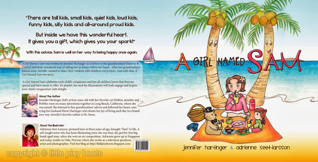
The new cover looks deceptively simple. But if one takes a closer look at the original illustration inside the book, then one would discover that many elements have been tweaked - the island has grown bigger, boat and trees have been shifted, waves and water have been added.
The title of the book has been moved down an inch so as not to "tangle" with the coconut leaves above. The horizon creates a natural focus for the eyes, so having the title there would be natural for the eye movement. Plus, I am assuming that many of the children would be getting used to the alphabet so block letters that are "halved" would be nice (think the use of graph paper in technical drawings); the colour of "SAM" corresponds with the jacket of Sam in the picture, and "A" is emphasized as a familiar letter of ABC. The two "As" had to be identical as well for simplicity, although not in colour.
Fonts were also streamlined so that kids learning their ABCs have an easier time adapting to the shapes of letters in their minds. My previous font was too "splashy", creating unnecessary dots and undulations in the shape of the alphabet.

I'm now quite pleased with the effect - there is enough contrast of YIN / YANG effect i.e. cool vs warm colours; the title is at the 2/3 rule of photography; colours are well-thought out and correctly placed. I also enlarged both the author's and my photos to a medium close-up shot, so that unnecessary detail is left out. Bios are shortened to make more space. Fonts that are hard to read (i.e. serif fonts) are for the adults :)
What do you think of the cover now?
Leave a comment and let me know :)
x
pixy


Comments
Post a Comment